Letterpress is often described as printing with pressure, but that phrase only tells half the story. The process combines a raised printing plate, a controlled film of ink, and a sheet that can accept both color and physical relief. The result is not just an image: it is a visual and tactile language.
That tactile quality is powerful, but it should support the message rather than compete with it. Good letterpress work balances paper, ink, impression, registration, and finishing so the piece feels intentional in the hand and remains easy to read.
What letterpress actually does
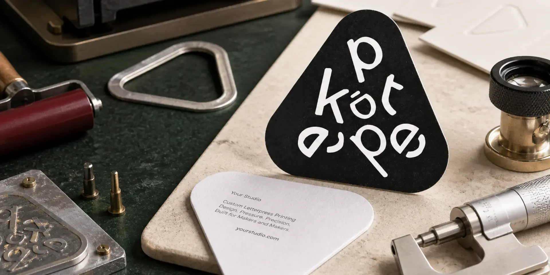
A photopolymer or metal plate carries the printable areas above the plate surface. Ink coats those raised areas, and the press transfers the ink to paper under pressure. Depending on the stock, the same pressure can also leave a visible impression around the printed form.
The mark is shaped by several variables at once: the plate depth and hardness, the pressure setting, the paper's bulk and compressibility, the size of the printed area, the ink coverage, and whether the sheet is printed on one or both sides. Change one variable and the rest of the balance may change with it.
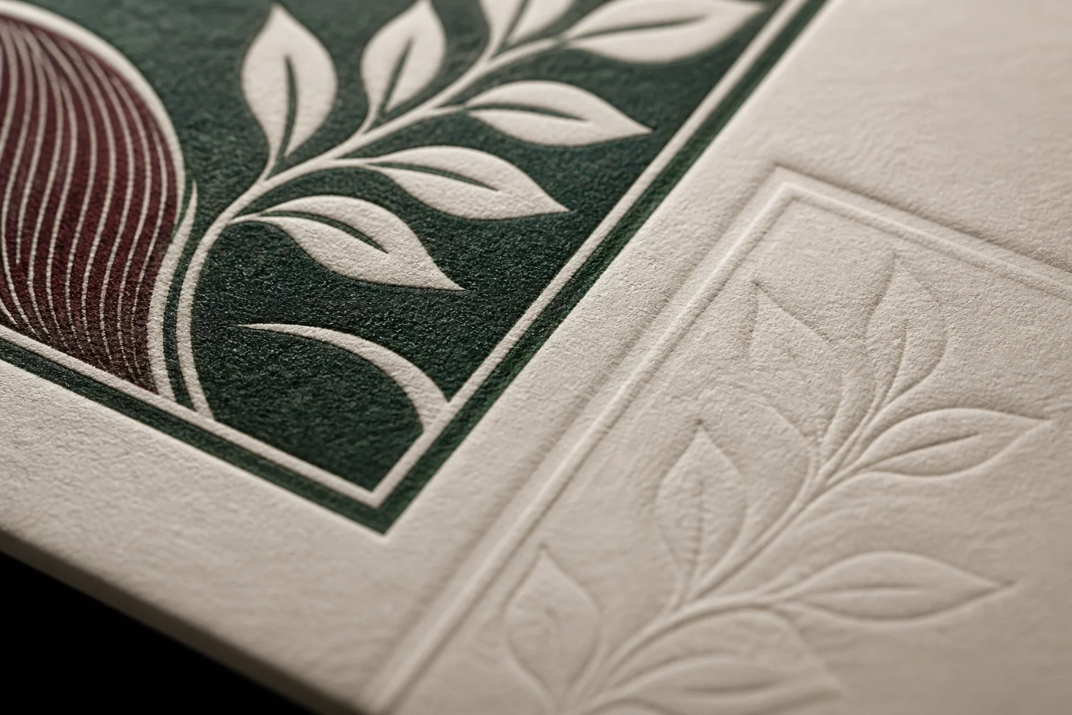
Impression is a design variable, not a trophy
A deeper impression is not automatically more premium. Too much pressure can distort fibers, show heavily on the reverse, weaken small type, or create an uneven edge around a large solid area. The best setting is the one that gives the intended tactile effect while preserving the structure of the sheet.
Before choosing a pressure level, ask three questions:
- What must the viewer notice first?
- Which parts should be felt, and which parts must remain quiet?
- How much reverse-side show-through can the finished piece accept?
Four practical impression levels
1. Kiss impression
The plate makes clean contact with the sheet, but leaves almost no visible mark on the reverse. This is useful for small type, fine rules, double-sided work, and layouts where legibility matters more than relief.
2. Standard impression
The printed area is clearly tactile without pushing aggressively through the sheet. This is the most versatile choice for premium business cards, logos, headings, invitations, and other work that needs a refined physical presence.
3. Deep impression
A deeper press creates immediate impact, especially on thick cotton stock and one-sided pieces. It needs more control because large shapes may deform the sheet and double-sided registration becomes more difficult.
4. Blind debossing
Blind debossing uses pressure without ink. It depends on light and shadow rather than color, making it effective for quiet patterns, borders, and minimal identities on thick cotton paper. The design needs enough scale and contrast in relief to remain visible in ordinary light.
Where letterpress performs best
- One or two spot colors with clear separation between each plate.
- Fine text, provided the type is large enough for the selected plate and stock.
- Linear illustrations, logos, borders, and simple geometric forms.
- Layouts with generous white space that let the impression breathe.
Where it needs restraint
Letterpress is not a substitute for process-color reproduction. Large flat solids can show variation as the ink meets a textured sheet. Continuous-tone photographs, gradients, and four-color images usually need another printing process. Very small reversed type and hairline rules can close up or disappear, especially inside a large solid area.
A useful design test is to temporarily reduce the artwork to black and white. If the hierarchy, fine detail, and separation between colors stop working without color, the file may be relying on effects that letterpress cannot reproduce reliably.
How to approve a production-ready impression
Ask for a proof on the actual stock whenever the impression is a major part of the brief. Inspect the front for clean edges, continuous ink, and a consistent tactile field. Turn the sample over and decide whether the reverse mark is acceptable. For double-sided work, check whether the two sides collide visually or physically.
A good press test should also remain stable across a representative run, not only on the first sheet. Once paper, plate, ink, and pressure are balanced, the result should feel deliberate from the beginning to the end of the batch.
Letterpress succeeds when pressure is treated as part of the composition. Start with the reading experience, choose the right paper, and let the impression add meaning rather than simply adding depth.
To see how deep an impression our cotton papers hold, get a free sample pack, or start your own card on our letterpress business cards page.