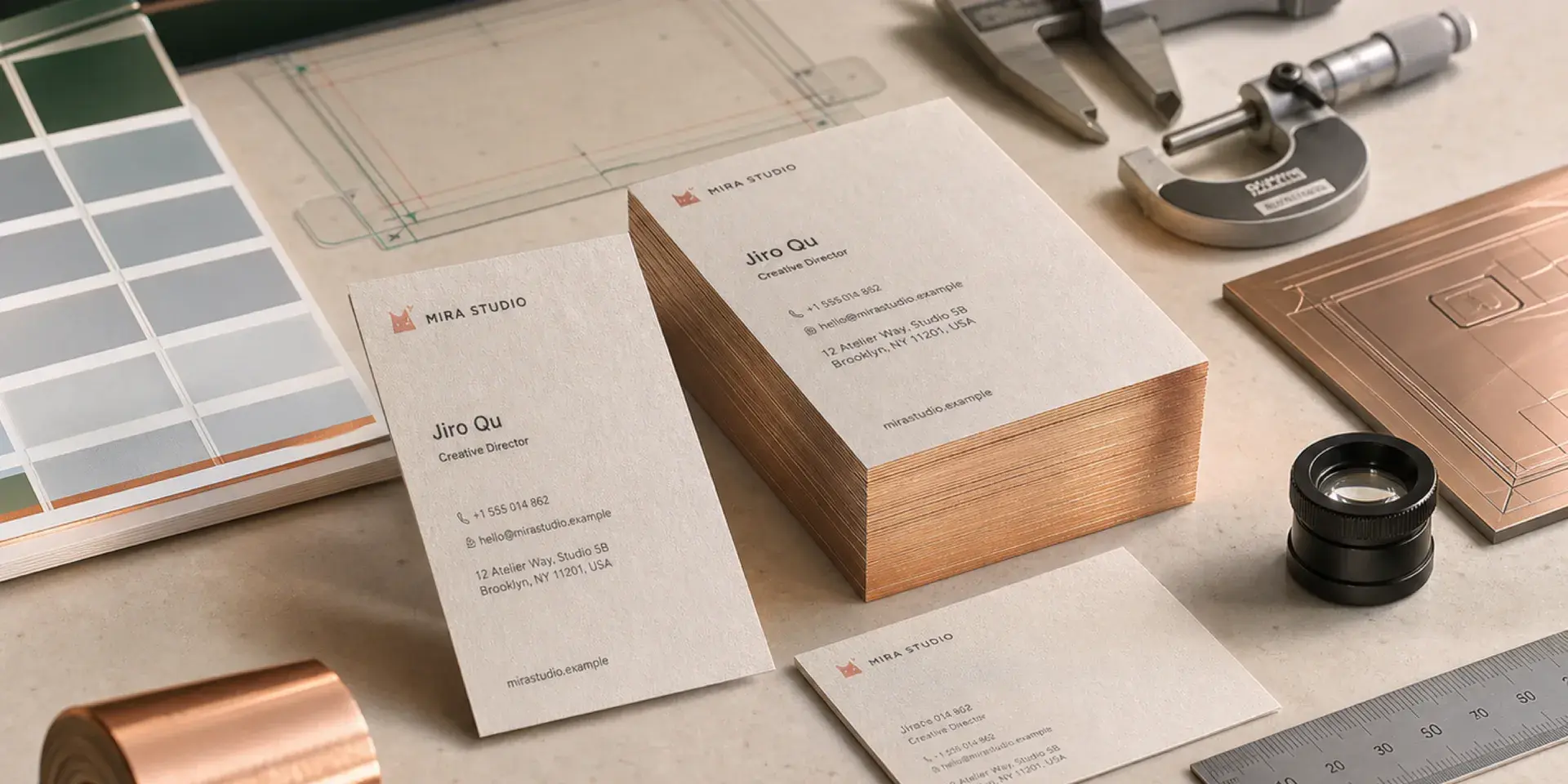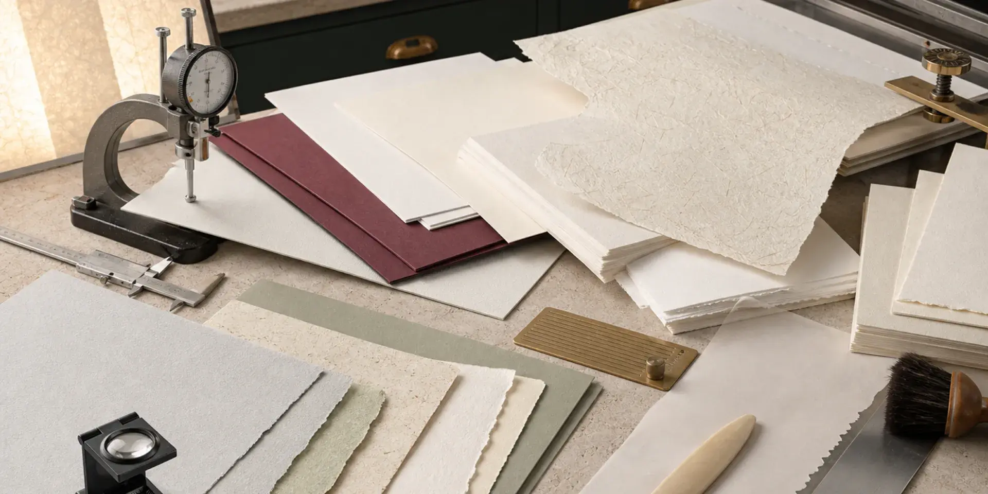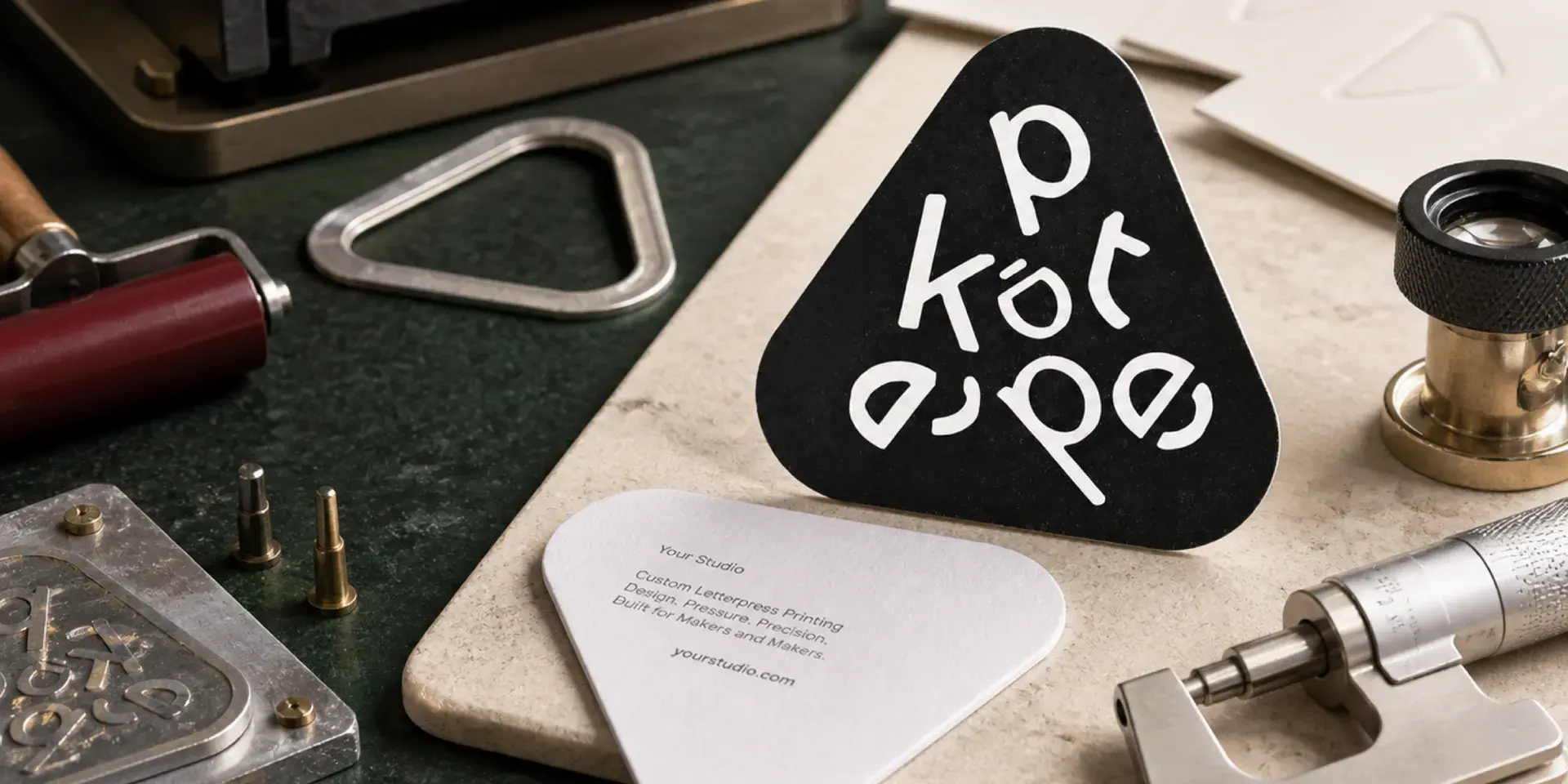
Finishing is not an afterthought in letterpress. Foil, blind debossing, embossing, die cutting, creasing, and edge treatments all affect the stock, the layout, the drying time, and the order of production. When the processes are planned together, each one reinforces the tactile idea. When they are added without a hierarchy, the result can feel busy and become difficult to manufacture.
Choose one tactile idea first
Start with the paper and impression that define the piece. Then add one primary finishing process that supports the purpose: foil for contrast and light, blind debossing for quiet relief, embossing for a stronger sculptural effect, or die cutting for shape and interaction.
Combining foil, deep debossing, embossing, spot UV, and multiple cuts can create information overload. A restrained combination usually feels more premium because the viewer can understand what to look at and what to feel.
How the main finishing processes behave
Foil stamping
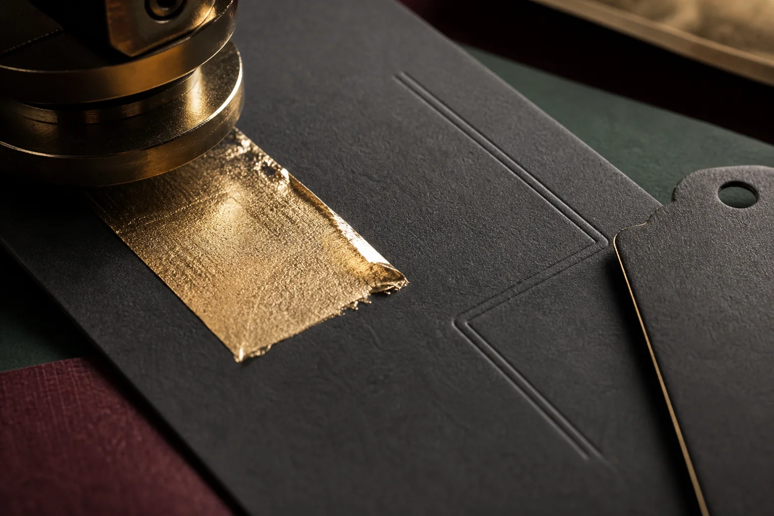
Foil is especially effective on dark paper and in small areas where metallic contrast can carry the design. Plan its sequence with the letterpress impression so the finished foil is not scratched or crushed by a later operation. Fine foil details need enough scale and a clean surface to release consistently.
Blind debossing
Blind debossing creates the strongest effect through light and shadow rather than color. Use shapes that are large enough to read in changing light, and avoid delicate details that may close up or flatten into the paper texture.
Embossing
Embossing uses a male and female die to raise the paper. It gives a stronger relief than a simple impression, but it also needs room around the edge of the form. Leave sufficient clearance from trim lines and test the stock for cracking, especially on brittle, coated, or laminated materials.
Die cutting and creasing
Provide a closed vector die path and keep cut, crease, and printed artwork separate. Orient the grain so folds and creases work with the sheet. A perfect impression cannot rescue a tag or folded piece whose structure is weak or whose cut edge tears during handling.
Four applications and what they teach
1. A high-end consulting business card
Format: 90 × 54 mm, double-sided.
Material and process: 300–350 GSM warm-white cotton, a burgundy spot-color logo, a fine champagne foil line, and a standard impression on the front. The information side uses a dark gray ink with a lighter impression.
Why it works: The brand area receives the tactile emphasis while the contact information stays quiet and readable. The card feels premium without making every element compete for attention. Because both sides are used, the impression is controlled instead of maximized.
2. A wedding invitation
Format: 140 × 200 mm with a matching envelope.
Material and process: 300 GSM natural-white cotton, burgundy main type with a standard impression, champagne foil details, and a light blind-deboss botanical pattern.
Why it works: The botanical structure is simplified enough to remain graceful on a textured sheet. The combination of ink, foil, relief, and open space creates elegance without filling the page with effects. The envelope and fold or insert should be proofed with the same attention as the invitation itself.
3. A dark-stock premium business card
Format: 88 × 50 mm.
Material and process: 350–500 GSM black uncoated stock, champagne foil for the logo, blind debossing for a secondary mark, and silver or white foil for essential information.
Why it works: Dark paper is treated as part of the palette rather than as a surface that needs to be covered with ordinary white ink. The relief gives the black stock depth, while foil provides the contrast needed for quick reading. A proof is essential because metallic coverage, small type, and dark fibers all affect the result.
4. A premium clothing hangtag
Format: 55 × 100 mm with rounded corners and a top hole.
Material and process: 250–360 GSM colored uncoated stock, grain parallel to the long edge, one spot color with a standard impression, rounded die cutting, a reinforced hole, and optional edge dye.
Why it works: The design prioritizes strength, grain, hole placement, and resistance to transport abrasion before chasing maximum impression depth. A tag is handled repeatedly, so its structure and edge quality are part of the brand experience.
Plan price and lead time from the process list
Cost and schedule are shaped by the number of colors and plates, the area of solid coverage, the complexity of the finishing, the number of dies, and the requested delivery date. Every extra color adds plate, ink, and setup work. Foil, embossing, debossing, die cutting, creasing, and edge treatments each add their own tooling or production stage.
Large solid areas can increase waste and make consistency more difficult. A high-value project should include a real-stock and real-ink proof before the full run. A realistic schedule includes plate making, drying or resting, finishing, quality control, and shipping, so confirm it for the chosen combination before you set a delivery date. For our own letterpress business cards, the product page shows the production time for each paper.
Finish with a hierarchy
The strongest letterpress pieces have a clear order: the stock establishes the feel, the impression gives the mark presence, and the finishing process adds a focused moment of contrast or interaction. Decide what the audience should see and feel first, then remove anything that does not support that decision.
When finishing is designed as part of the object—not added at the end—it becomes a practical extension of the brand story.
Our finishes page shows which finishes each of our cards can take, and a free sample pack lets you feel foil and deboss on real cards before you order.