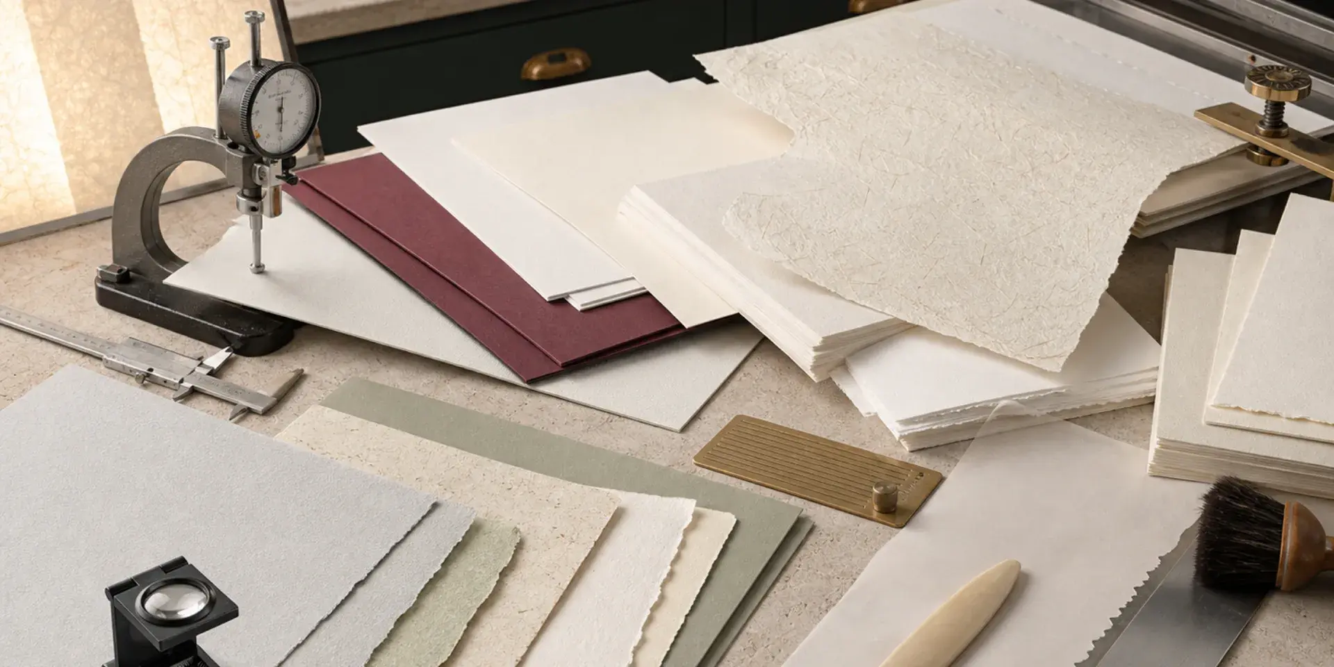
In letterpress, paper is not a passive background. It affects the color of the ink, the depth of the impression, the drying time, the feel of the finished piece, and how well later finishing processes behave. Choosing stock is therefore a production decision as much as a design decision.
The most reliable way to select paper is to work backwards from the intended experience: decide how the piece should feel, determine how much compression the sheet can take, then test ink absorption, grain direction, thickness, and finishing compatibility together.
A practical paper-selection sequence
- Define the desired tactile effect: quiet contact, a visible impression, or a deep relief.
- Compare the bulk and compressibility of candidate stocks rather than relying on weight alone.
- Check how the surface absorbs and dries ink, especially for large areas.
- Orient the grain so folds, creases, and long edges work with the sheet rather than against it.
- Confirm that the stock can accept foil, embossing, die cutting, or other planned processes.
- Approve a proof on the actual stock before committing to the full run.
The physical traits that matter most
Compressibility
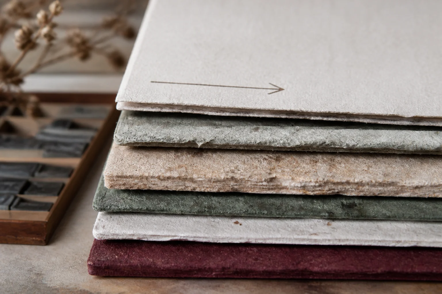
Soft cotton stocks compress readily and can hold a beautiful impression. A brittle, heavily coated, or laminated sheet may resist the press or crack around a deep mark. The best choice depends on the desired relief, not just the quoted GSM.
Bulk
Bulk describes how much physical volume a sheet has for its weight. A high-bulk sheet can feel substantial and accept relief without being unusually heavy. Two papers with the same GSM can therefore produce very different tactile results.
Sizing and absorption
Surface sizing controls how quickly ink moves into the fibers. A more absorbent sheet can soften edges and create a warm, handmade look; a harder surface can preserve sharper detail. Large solids deserve special attention because absorption differences are easier to see across a broad area.
Grain direction
Paper folds and creases more cleanly with the grain. For folded invitations, envelopes, and tags, align the grain with the long edge or the primary fold whenever the format allows. Grain direction also influences how a thick sheet feels when handled and how it behaves during die cutting.
A useful starting matrix
| Stock family | Strengths | Best suited to | Watch for |
|---|---|---|---|
| 300 GSM 100% cotton | Soft feel, high bulk, clear impression, natural or bright white options | Business cards, invitations, envelopes, stationery | Absorption and surface variation can make large solids uneven |
| 500–600 GSM double-thick cotton | Heavy presence, strong relief, suitable for edge dye and premium handling | Luxury cards, membership cards, gift cards | Higher cutting and die costs; front and back pressure must be balanced |
| Cotton blend or high-grade wood pulp | Good detail, stronger surface, often more economical | Corporate cards, letterheads, tags | Deep impressions may be less pronounced; brittle surfaces need testing |
| Rough or recycled texture | Strong tactile character and a visible sustainability story | Simple, bold typography and expressive packaging | Fine lines may break; dust, flecks, and batch variation are part of the look |
What changes on dark paper?
Standard white letterpress ink is usually translucent. On a dark sheet, the stock can show through and make the color look muted. If the design needs a truly opaque white, consider white foil, screen printing, or mounting a light sheet instead of expecting ordinary letterpress ink to behave like paint.
Dark stock is often most successful when its value comes from the combination of impression, foil, and controlled contrast. A blind deboss or metallic foil can reveal the paper's character without fighting the material.
Proof the combination, not just the components
A paper sample alone cannot tell you how ink will dry, and an ink drawdown cannot show how a deep impression will affect the reverse. Make a small proof that combines the actual stock, color, plate, pressure, and any planned finishing. Check small type, broad coverage, registration, fold or crease lines, and the edge condition after cutting.
The right paper makes the press work easier and the design feel more coherent. Select for compression, surface, grain, and finishing compatibility together, then let a real-stock proof settle the final decision.
The papers we print letterpress on, with their weights, are listed on our letterpress business cards page. Our free sample pack includes letterpress cards, so you can feel the paper and the impression first.